Overview

Hidden Stories is an Augmented Reality Mobile Application that users can scan the AR markers where located in the Chinatown storytelling Centre in Vancouver. Despite the century-long presence of Chinese in Canada and their enormous influence on history and culture, there is no main facility where this story and its photographs and artifacts are actively collected, housed and showcased.

Role

Design Lead (UX/UI)
Main contributed in persona, user stories, interview, user behavior checklist, usability test user flow, wireframe, UI, and logo design. I also participated in ideation and in-person interview.

Client
Chinatown Storytelling Centre
Location
Vancouver, Canada
Work
Ui/UX DESIGN, product design, App design
Team
Annita Chow, Chloe Lu, Samantha Yueh, Jackie Xu, Karl Kim, Lawson Cofield
Categories
UX

CHALLENGE

The primary challenge is that the Chinatown Storytelling Centre is trying to tell a big story in a small space. There are many stories and images that the museum can’t display because there is no physical room to showcase them. To interact with visitors, interaction is one of the significant element in the application so that can attract different generations of visitors. Many great stories haven't been hearing, how do we put more stories into the application that the museum can expand it in the future?

Solution

We created an app called Hidden Stories that is an AR storytelling experience. Visitors to the museum can use their phone to hover over placemarkers and get more information about stories behind the artifacts.

Demo

Design Process

The reason to use

Augmented Reality

Augmented reality is a new way to tell the stories, which can bring the interaction to the design, and users don't have to spend too much time to adopt the new technology.

Persona

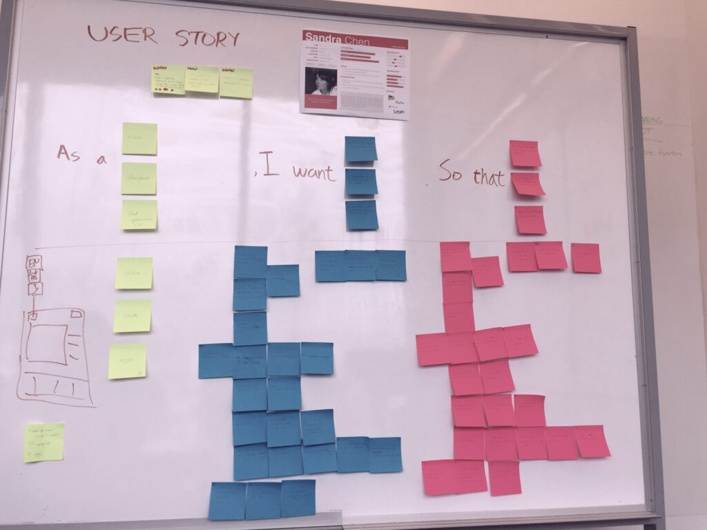
Based on the workshop we set up a couple of personas. We referred to them throughout the entire product development process.

User research
We researched the different type of museums' target audience.

Involved stakeholders
Based on stakeholders, it was a wide range of audience including school tours, tourists, and Vancouver residents.

At this point, we decided to narrow the target to parents and used a parent as our choice for the persona. They reach both children and older generations, bridging the gap between the two demographics. Also, they are the ones who take their family or students out for trips. Usually, they understand their parents, children, and/ or students needs the most.

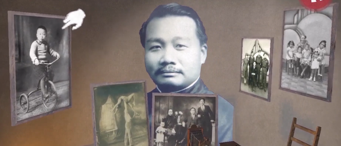
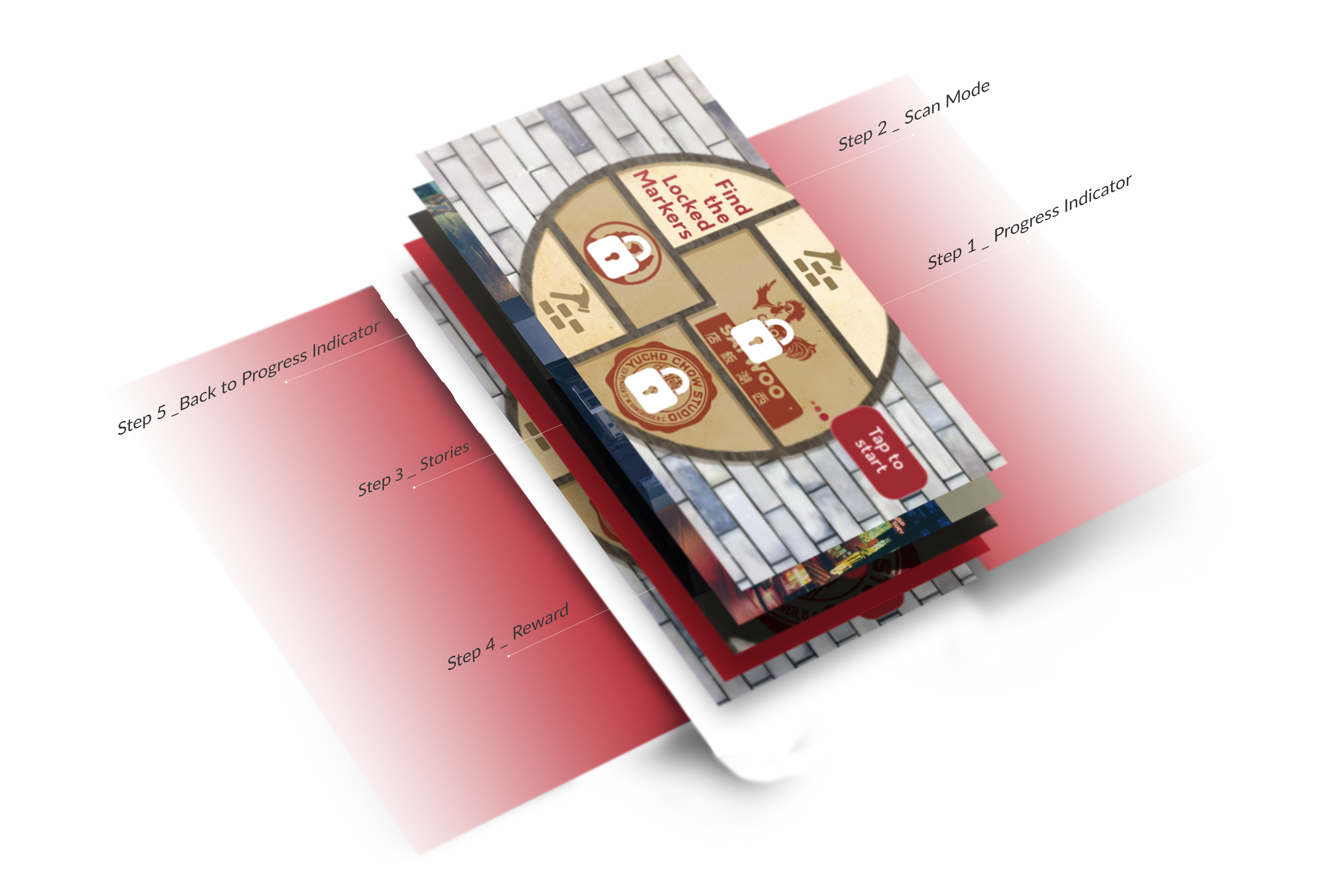
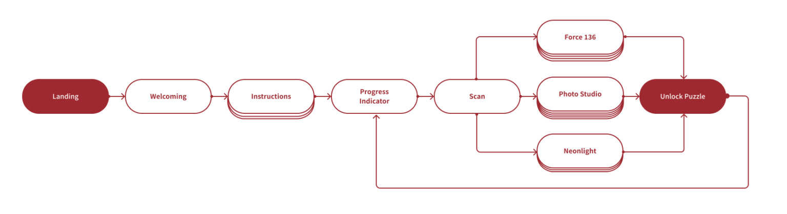
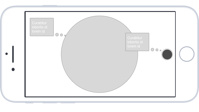
We understood the persona and found the pain points and emotional attachments, which affect the design of the app. How to bring the moment to the AR app?

To bring the moment, we built a 3D environment in the AR space, that users can see the detail of each story and image.

User Story

We conducted a design sprint to understand our users’ experience, habit and behaviour, so that we could make informed decisions regarding our product features.

After user story process, we realized that emotions and impressions would be the goal of th design.
  •   How might we leave long lasting impression to our visitors so that they will share their experience in the Chinatown Story Centre to their friends and families?
  •   How might we get visitors to be eager to learn more after their visits?
  •   How might we bring the emotional attachment to visitors?

Whoever has the emotional attachment would be the one visit the storytelling centre.
To solve the questions, there were some elements should be there.
  •   Interaction
  •   Story catalogue
  •   Gamification
  •   Images choose
  •   Story scenario

User Flow

After user research, we started to find target audiences, problems, solution.

Wireframe

At the beginning of my design process I created wireframes for testing purposes.

  • To figure out the users can understand what our app is about
  • We used a digital and low fidelity prototype.
  • To create this wireframe, I used Sketch.
  • I created 4 iterations.

After the internal and external user test, we use "Keep, Fix, Change" (K.F.C.) tool to execute the feature or UI elements.

Colour

The colours we chose were meant to emulate the rich Chinese Canadian history in Vancouver Chinatown as well as draw visitors into the stories experiences. We used red as our primary brand colour as it has strong associations with Chinese culture. Neutral supplementary colours are Ebony, Racing Green, Smokey Grey, Harvest Gold, and Pale Grey.

Logo

We used a Chinese character meaning “history” for our logo to draw the connection to the past. We have “故” as our visual emblem, which represents our concept of past hidden stories.

Reflection

At the beginning of the project, my biggest fear was how to build an AR app pipeline. I didn’t have experience with xR design at the time. When I created a wireframe for a website, I can imagine how they would look like in my mind. A website is a page by page, but AR is frame by frame and 3D elements. With AR, I needed to combine with the physical space. We talked to some specialist from different companies to understand AR more. Wilson Tang from Yumebau gave us some feedback and explained the user experience in AR. I realized that I needed to think about the layers between. Our programmers helped me to implement the UI into the Mockup and tested it. We set right next to each other in order to get the immediate feedback and visualized it.